결과 화면 :
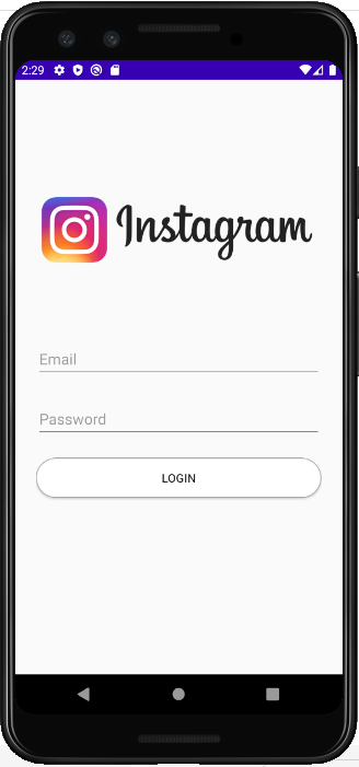
먼저 로고를 가지고 와서 drawable에 넣어둔다.
일반적인 Linear Layout을 이용하면 화면에 다 붙어버리기 때문에, Relative Layout 내부에 Linear Layout으로 모든 요소를 묶고, padding을 주어 가장자리와의 거리를 벌린다.
<?xml version="1.0" encoding="utf-8"?>
<RelativeLayout
    xmlns:android="http://schemas.android.com/apk/res/android"
    xmlns:app="http://schemas.android.com/apk/res-auto"
    xmlns:tools="http://schemas.android.com/tools"
    android:layout_height="match_parent"
    android:layout_width="match_parent"
    tools:context=".MainActivity"
    >

    <LinearLayout
        android:layout_width="match_parent"
        android:layout_height="match_parent"
        android:orientation="vertical"
        android:paddingLeft="25dp"
        android:paddingTop="80dp"
        android:paddingRight="25dp">
이미지뷰는 간단하게 높이와 margin만 둔다.
        <ImageView
            android:id="@+id/imageView"
            android:layout_width="match_parent"
            android:layout_height="200dp"
            android:layout_marginBottom="15dp"
            app:srcCompat="@drawable/instagram_logo" />
텍스트 필드는 안드로이드 내장 디자인으로는 쉽게 낼 수 없으므로 meterial library를 이용하여 디자인한다.
https://material.io/components
Material Design
Build beautiful, usable products faster. Material Design is an adaptable system—backed by open-source code—that helps teams build high quality digital experiences.
material.io
이 중 텍스트 필드를 이용하는데, 먼저 의존성을 걸어준다.
Getting Started 페이지에서 의존성 링크를 찾아야 한다.
material-components/material-components-android
Modular and customizable Material Design UI components for Android - material-components/material-components-android
github.com
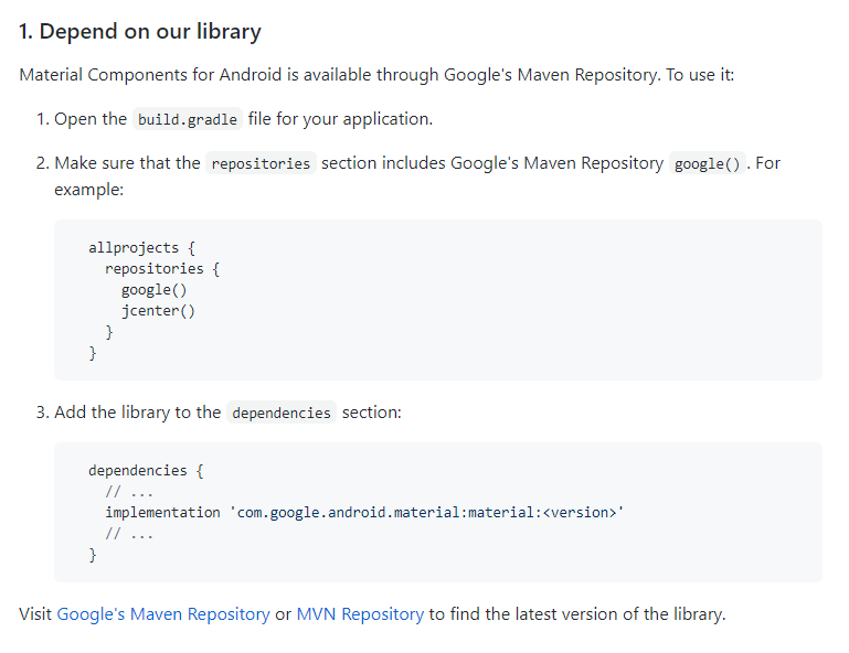
이 의존성은 gradle 중 app에 걸어준다.

implementation 'com.google.android.material:material:1.2.0-alpha05'
버전은 MVN Repository 에서 Meterial Componenet를 찾으면 여러 버전을 찾을 수 있다.
https://mvnrepository.com/artifact/com.google.android.material/material
Maven Repository: com.google.android.material » material
Material Components for Android is a static library that you can add to your Android application in order to use APIs that provide implementations of the Material Design specification. Compatible on devices running API 14 or later. VersionRepositoryUsagesD
mvnrepository.com
이제 Using text field 코드를 Design Code 필드에 추가해보자.
이메일 입력 필드와 비밀번호 입력 필드가 필요하므로, 두 개를 추가한다.
        <com.google.android.material.textfield.TextInputLayout
            android:id="@+id/tf_email"
            android:layout_width="match_parent"
            android:layout_height="wrap_content"
            android:layout_marginTop="8dp"
            android:layout_marginBottom="8dp"
            android:hint="Email">

            <com.google.android.material.textfield.TextInputEditText
                android:layout_width="match_parent"
                android:layout_height="wrap_content"
                android:inputType="textEmailAddress" />

        </com.google.android.material.textfield.TextInputLayout>

        <com.google.android.material.textfield.TextInputLayout
            android:id="@+id/tf_password"
            android:layout_width="match_parent"
            android:layout_height="wrap_content"
            android:layout_marginTop="8dp"
            android:layout_marginBottom="8dp"
            android:hint="Password">

            <com.google.android.material.textfield.TextInputEditText
                android:layout_width="match_parent"
                android:layout_height="wrap_content"
                android:inputType="textPassword" />

        </com.google.android.material.textfield.TextInputLayout>
이 때, 비밀번호나 이메일, 두 가지이기 때문에 inputText 속성을 이용하여 필드의 입력 속성을 변경한다.
마지막으로 버튼을 추가하는데, 저 버튼 역시 클릭했을 때 변경되는 속성을 만들기 위해 드로어블을 이용한다. 따라서, 드로어블을 추가할 수 있는 CompatButton을 사용한다.
        <androidx.appcompat.widget.AppCompatButton
            android:layout_width="match_parent"
            android:layout_height="wrap_content"
            android:background="@drawable/white_rounded_button"
            android:layout_marginTop="15dp"
            android:text="Login" />
    </LinearLayout>
참고하는 white_rounded_button은 다음처럼 만든다.
<?xml version="1.0" encoding="utf-8"?>
<selector xmlns:android="http://schemas.android.com/apk/res/android">
    <item android:state_pressed="true">
        <shape>
            <solid android:color="@android:color/holo_blue_light"/>
            <stroke android:color="@android:color/black"
                android:width="1dp"/>
            <corners android:radius="50dp"/>
        </shape>
    </item>
    <item>
        <shape>
            <solid android:color="@android:color/white"/>
            <stroke android:color="@android:color/darker_gray"
                android:width="1dp"/>
            <corners android:radius="50dp"/>
        </shape>
    </item>
</selector>
solid는 내부 색, stroke는 외부의 색이다. radius를 통해 테두리를 깎아 만든다.
(드로어블 등록법)
https://itstudy-mary.tistory.com/176
안드로이드 스튜디오] 마우스를 클릭하면 변경되는 버튼 제작하기
안드로이드 스튜디오의 드로어블은 뷰의 속성에 따라 그리는 개체이다. 원래 우리가 화면에 그릴때는 소스코드로 제작하지만 드로어블은 xml로 관리한다. 주로 사용하는 것은 상태 드로어블과 �
itstudy-mary.tistory.com
만든 xml을 버튼의 background에 등록하면 완성할 수 있다.
'Android' 카테고리의 다른 글
| 안드로이드 스튜디오,java] 간단한 계산기 앱 만들기 (0) | 2020.07.14 |
|---|---|
| 안드로이드 스튜디오(JAVA)]카운팅 앱 만들기 (0) | 2020.07.14 |
| 안드로이드 스튜디오] 마우스를 클릭하면 변경되는 버튼 제작하기 (0) | 2020.07.14 |
| 안드로이드 스튜디오 단말에서 Action Bar 제거하기 (0) | 2020.07.10 |
| 안드로이드 스튜디오 이미지 뷰(image view)를 둥글게 만드는 법 (0) | 2020.07.10 |


