Hybrid/React Native
리액트 네이티브] 8. flex와 범위
김마리님
2022. 12. 14. 11:01
앱을 개발하다보면 Upper Tab과 Bottom Navigation의 크기를 고정하고, 가운데의 Content의 크기를 유동적으로 조절하는 일이 많다.
일단 기본적으로 하듯이 Upper Tab과 Bottom Navigation의 크기를 고정해보자.
- ./src/component/Layout.js
import React from "react";
import { View, Text, StyleSheet } from "react-native";

export const Header = () => {
    return (
        <View style={[styles.container, styles.header]}>
            <Text style={styles.text}>header</Text>
        </View>
    );
};

export const Contents = () => {
    return (
        <View style= {[styles.container, styles.contents]}>
            <Text style={styles.text}>contents</Text>
        </View>
    );
};

export const Footer = () => {
    return (
        <View style = {[styles.container, styles.footer]}>
            <Text style={styles.text}>Footer</Text>
        </View>
    );
};

const styles = StyleSheet.create({
    container : {
        width : '100%',
        alignItems : 'center',
        justifyContent : 'center',
        height : 80,
    },
    header : {
        backgroundColor : '#f1c40f',

    },
    contents : {
        backgroundColor : '#1abc9c',
        height : 640,
    },
    footer : {
        backgroundColor : '#3498db',
    },
    text : {
        fontSize : 26,
    },
});
- .src/App.js
import React from "react";
import {StyleSheet, View, Text} from "react-native";
import { viewStyle, textStyle } from "./styles";
import { Contents, Footer, Header } from "../component/Layout";
import EventButton from "../component/EventButton";

const App = () => {
    return (
        <View style = {viewStyle.container}>
            <Header />
            <Contents />
            <Footer />
        </View>
    );
};

export default App;
- App.js
import App from './src/App';

export default App;
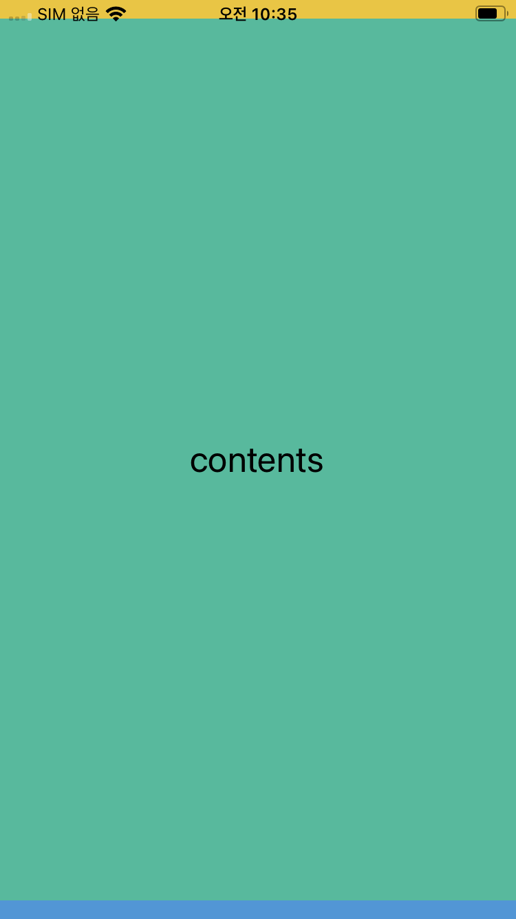
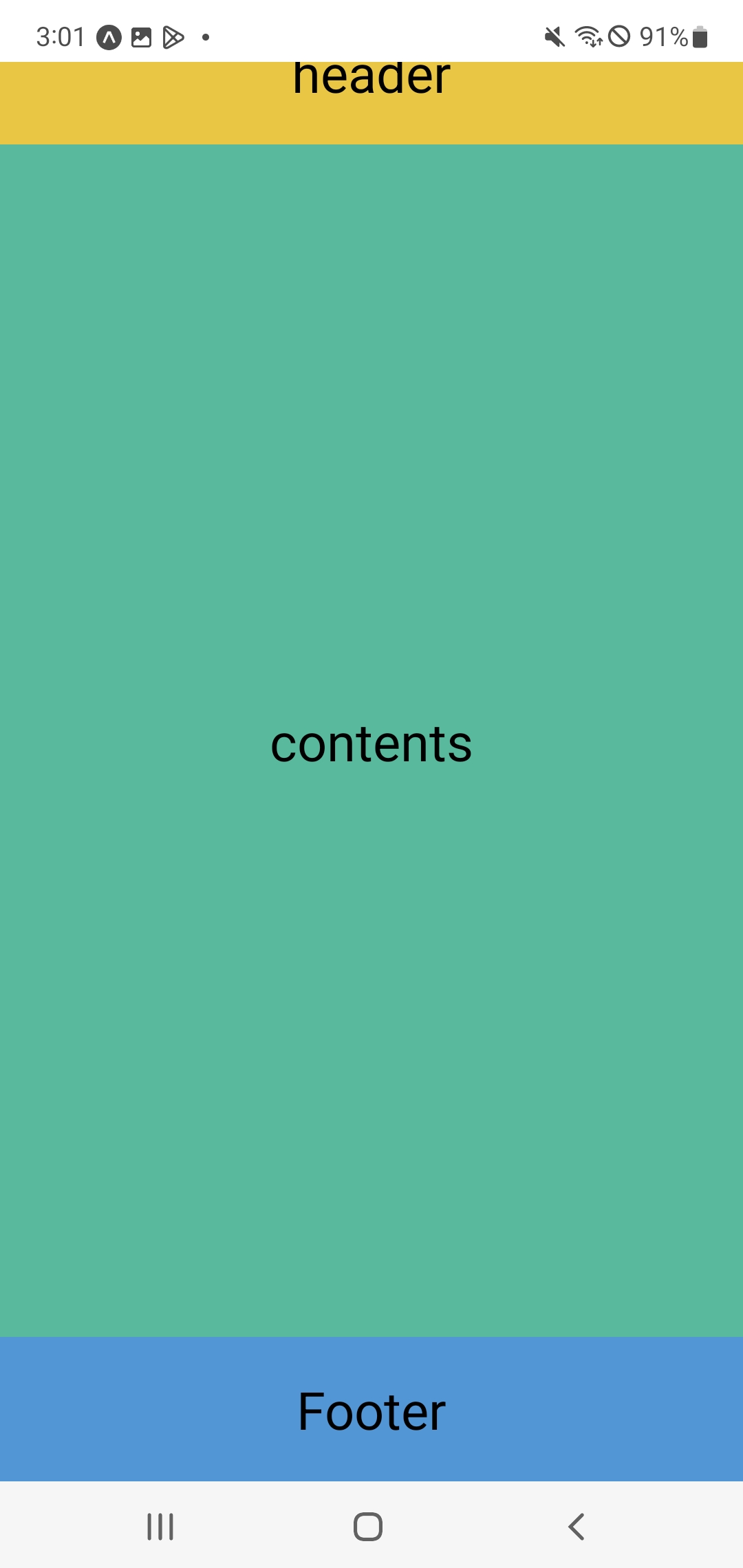
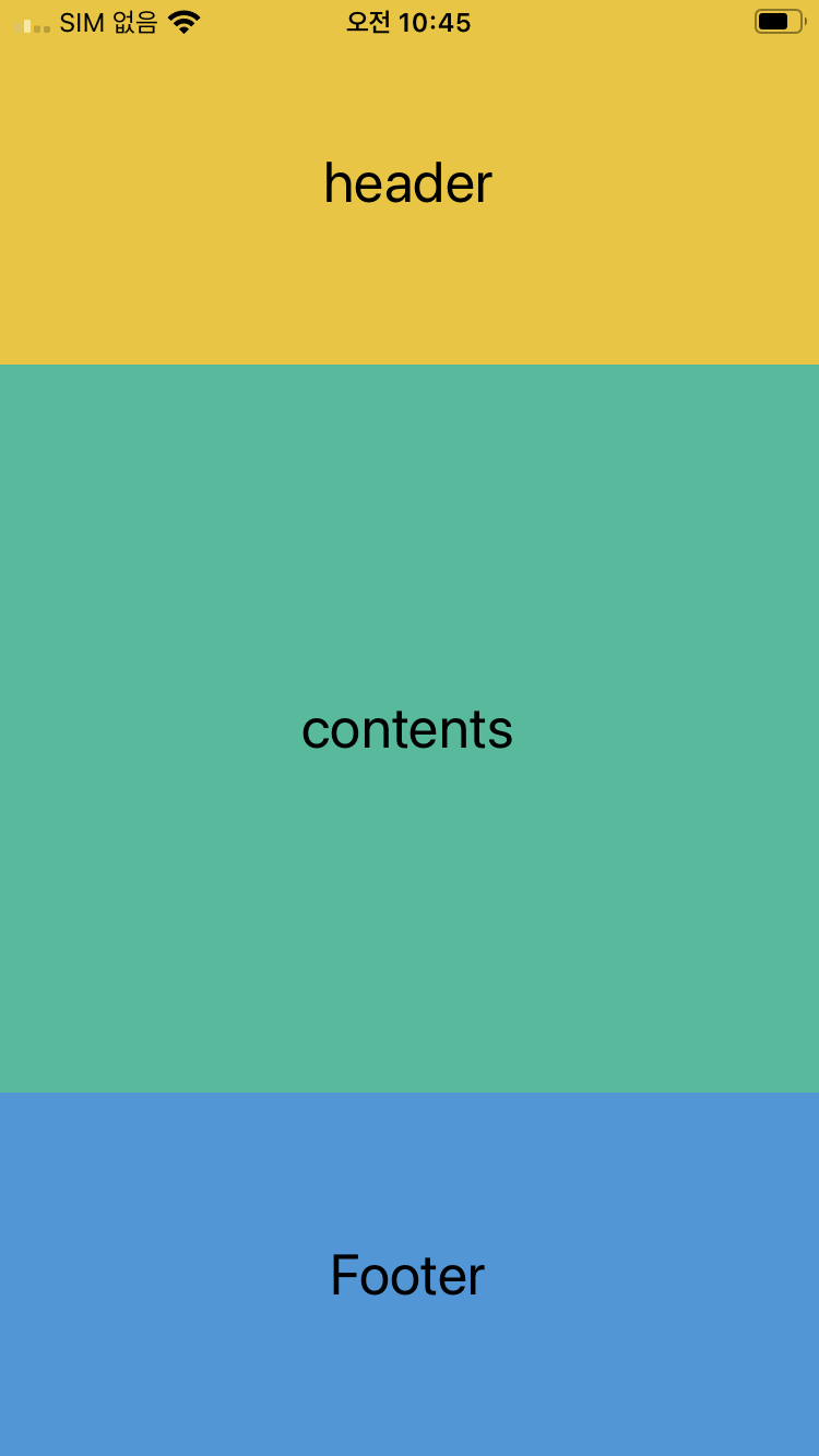
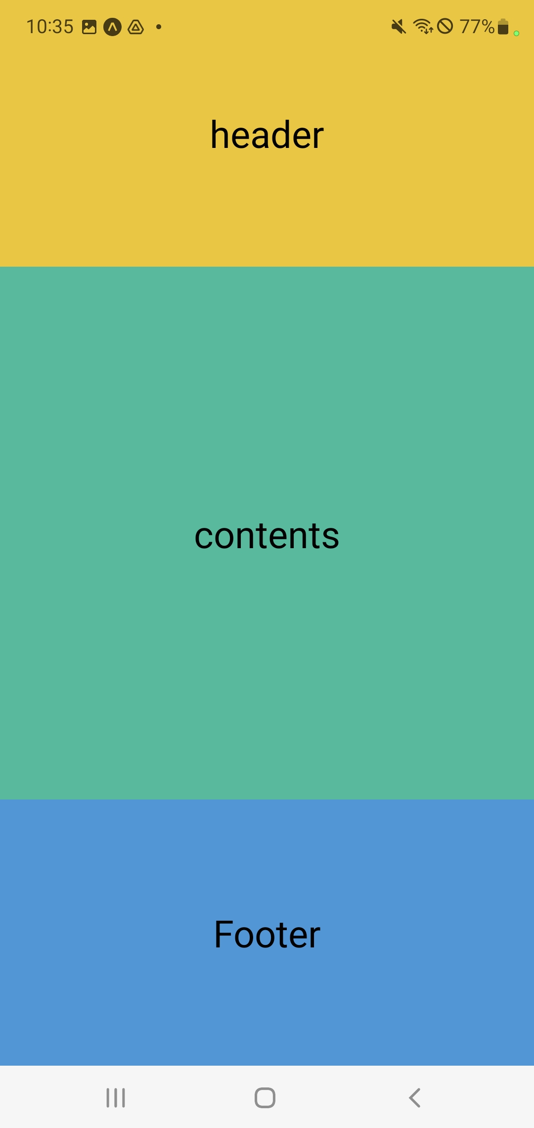
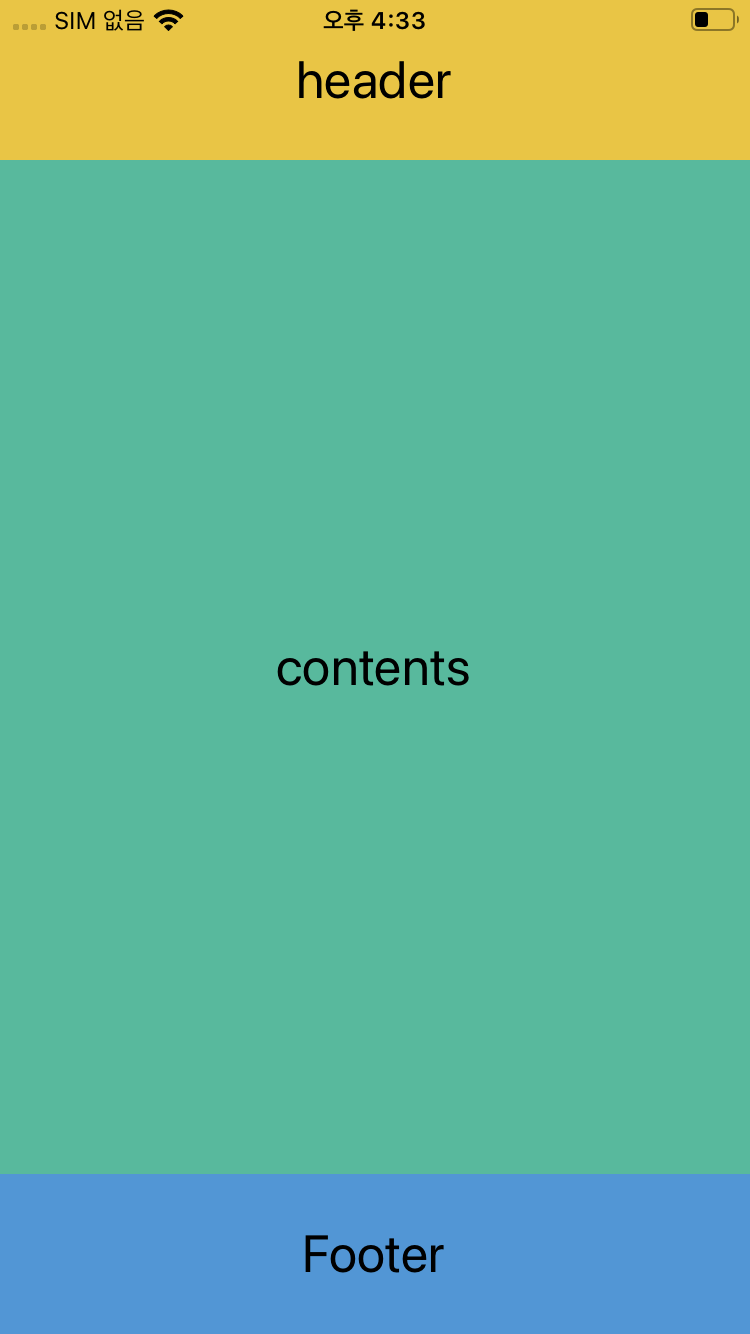
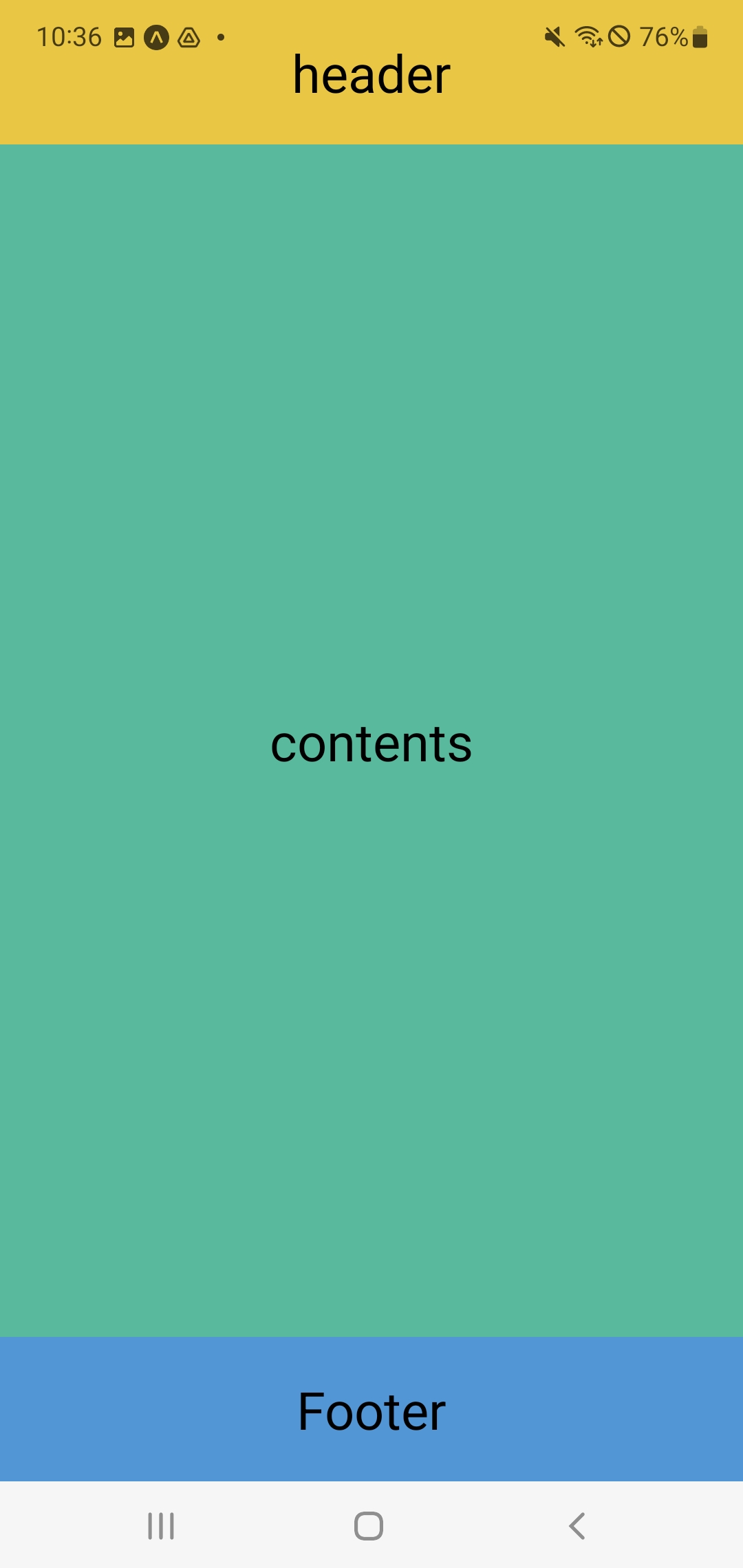
이 앱을 빌드하면 위에 헤더, 중간에 컨텐츠, 아래 푸터가 있는 앱이 만들어진다.
이 때, 기기의 비율이 달라지면 공백이 생기거나 잘리거나 하는 문제가 생긴다(사진들)
이를 해결하는 방식이 flex이다.
레이아웃 파일의 스타일에 플렉스를 적용해본다.
- ./src/component/Layout.js
...

const styles = StyleSheet.create({
    container : {
        width : '100%',
        alignItems : 'center',
        justifyContent : 'center',
        height : 80,
    },
    header : {
        backgroundColor : '#f1c40f',
        flex : 1,
    },
    contents : {
        backgroundColor : '#1abc9c',
        height : 640,
        flex : 2,
    },
    footer : {
        backgroundColor : '#3498db',
        flex : 1,
    },
    text : {
        fontSize : 26,
    },
});
이를 적용해보면 다음과 같이 변한다.
flex를 적용하면 화면을 해당 비율로 가득 채운다는 것을 알 수 있다.
그렇다면 고정해야할 건 고정하고, 나머지를 flex를 하면 될 것이다.
- ./src/component/Layout.js
const styles = StyleSheet.create({
    container : {
        width : '100%',
        alignItems : 'center',
        justifyContent : 'center',
        height : 80,
    },
    header : {
        backgroundColor : '#f1c40f',
    },
    contents : {
        backgroundColor : '#1abc9c',
        flex : 1,
    },
    footer : {
        backgroundColor : '#3498db',
    },
    text : {
        fontSize : 26,
    },
});
반응형